")
")


")


")


EPISODE 4 OF WHAT WOULD THEY DO? THE CUSTOMER EXPERIENCE PODCAST FOR SMALL BUSINESS OWNERS
NOTE: Some of the tools and resources mentioned in these shownotes could be affiliate links. That means when you click the link to create an account, start a free trial or make a purchase, it won’t cost you any more but I may receive a commission for introducing you. One thing I want to stress is that I would never recommend anything or anyone I haven’t successfully worked with myself or trust unconditionally.
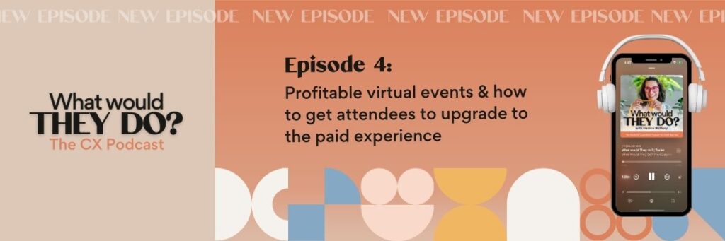
In this episode, I answer a question from a Copy Confidence Collective member about how to naturally encourage free virtual event attendees to upgrade to a paid offer… without feeling pushy or salesy.
The member question: “What’s a compelling way to get the attendees of a free virtual event to opt into the paid upgrade so it feels natural and not salesy?”
I explore effective strategies to monetize your virtual events, via tweaks to your paid upgrade positioning, making it easy to upgrade, and creating clever genuine urgency (without necessarily having to discount).
Whether you’re running a virtual summit, an online challenge, or a free event with a paid VIP option, today is all about customer-first strategies to make the upgrade feel like the obvious next step without devaluing the free experience.
Ready to maximize the results for you and your attendees?
What we cover:
Why Your Website Should Be More Than a Sales Page – The importance of treating your website as a relationship-building tool, not just a place to list offers
The Biggest Mistakes Business Owners Make with Their Websites – Common pitfalls to avoid
Infusing Personality and Trust into Your Website Copy – How to stand out in a crowded market by making your messaging feel uniquely you.
Creative Ways to Create a Client Magnet Website Experience – Using interactive elements to make your browsers’ lives easier
00:00 Introduction to Customer Experience Challenges
00:24 Understanding Free vs. Paid Event Dynamics
01:55 Reasons for Upgrading at Free Events
09:27 Strategies for Encouraging Upgrades
16:17 Final Thoughts on Event Structuring
Soundbites:
“So a quick CX lesson here: when it comes to free online events that you’re trying to monetize, make sure you position the paid event experience as the next level experience or a missing piece of the puzzle that they need to get the results they’re after. And staying away from positioning your event, your free event experience as something that is simply an alternative, a second choice. And if you do that, your event sales are going to feel good because you’ve given people a clear choice to take that step up.”
😍 Love the show?
Submit your question so I can answer it in an upcoming episode (or invite the perfect guest expert!).
Hit subscribe/follow so you never miss a new episode and leave a positive review:
Post a screenshot with your key takeaway on your IG story and tag me @candocontent and #WWTDpod so I can repost your content.
Your next steps:
Find out how you can get my strategic customer experience brain on your brand here.
Binge-listen to Mastering CX, the FREE private customer experience podcast with 24 bite-sized tips, tricks & strategies to create a REMARKABLE brand experience before, during and after the purchase. Listen FREE here!
Join Retention Lab 🧪, the membership for savvy online business owners determined to grow their revenue, referrals and repeat business without more marketing. Join here!
Check out my favourite CX tools and resources here.
Episode Transcript:
Hey hey and welcome to this next episode of What Would They Do? Today we are looking at all things customer experience for your website and how you can turn it into a connection driving, delight boosting opportunity early on in your interactions with potential customers.
So the question that I received is from my business buddy, Jessica Haynes from Jessica Haynes designs. She happens to be a website designer and was wondering this as a web designer, I know copy and design are super important, but I’m always looking for fun ways for my clients to connect with their visitors on a deeper level. As a customer experience strategist, how would you approach this for website projects?
So, if you are pretty new to my universe, yes, I am a customer experience strategist, but I’m also an audience driven copywriter. So that means I work with a lot of small business owners and online business owners on their web presence. And what I pride myself on and what I find super important is that we cannot just look at our website as the sales driving machine. We really need to treat it as something that goes beyond that, that goes deeper and really organically sells people into our vision, into what we have to say, into us as business owners and service providers well before they jump on a call with us. And how you do that best is by yes, having very specific words on your website, having a well-designed website that looks the part, but also tapping into emotions, into the hormones.
Let’s face it, you know, I’m a copywriter, Jess is a web designer. These are crowded marketplaces and with AI making things seemingly so much easier, the competition has become even harder. And I really think know your website is the opportunity the number one opportunity for you to stand out for the right reasons and really create a remarkable first touch point on the beginning of your customer journey with this potential client. So let’s start before we get into the little delight opportunities and the fun ways to spice up your website. Let’s start with the biggest mistakes I see when it comes to website projects and how they are designed and set up and treated as part of the bigger online business picture. There’s so many websites that follow the same same principles especially in the coaching space where the language they’re using is so generic so same same that it’s really hard to work out what someone does and why they are different to the other hundred coaches that are using the same language of empowering, upleveling and boosting XYZ.
We need to start with a website that has very specific language that really resonates with our audience, but also infuses our personality in it. There’s no point putting on a facade and putting on a mask because you think you have to, and it’s the expected thing to do in your industry and niche if you get lost in the process. People want to work with you as a coach, as a service provider, as a course creator, because they value what you have to say. They resonate with how you show up online. So your website really needs to encompass all that. It needs to be a collection of your best bits, right? Your best language, your best vibes, your best photos. It really is the starting point for hopefully a lasting customer experience and showing up just like everyone else is not going to do you any good. Next up websites often come with a million pages and no clear path to actually get to the destination.
So as tempting as it is to come up with convoluted structures that let you jump through 10 hoops to even get to the sales page. I really believe in the website being a starting point for a conversation. So you don’t want your website to tell people everything, every little detail about your product, unless it is, a high ticket sales program, coaching program that you sell via a sales page. If you are a service provider, you know, give them experience. Give them insights into what it’s like working with you. Give them a starting from price to then get them on a call with you where you can sell them into your zone of genius and talk price in more detail and really on that call get to the bottom of objections etc. Things holding them back that might have been a deal breaker if you communicated those on the website. So really less is more when it comes to websites and making it more about your values, your ways of working, your ways of approaching business is a much smarter move than giving them all the things and overwhelming people while they’re busy skim reading and missing the mark anyway.
A lot of websites have absolutely no personalization and while It might seem hard without again, lavish corporate budgets and you know, conditional content and all these fancy tools. You can absolutely infuse levels of personalization and even your personality into your website. So every visitor feels like they’re treated as an absolutely priceless visit to your website, someone you absolutely want to serve in your business. So what we are going to do this episode is give you some practical ways how you can infuse personalization into your website, how you can touch on the senses and also stand out from all the same sameness out there. Let’s start with the first little tip slash hack slash strategy that I absolutely love and it’s so easy to do yet often is overlooked. So let’s start with your contact.
Often when people reach out to me to work with me on their website copy, I jump over to their contact page, you know, just have a look at how their website is currently looking. And the contact page is just so sad. It is a stock standard form that feels so transactional. It totally lacks personality and really leaves a lot to desire. So inside my projects, particularly for service providers where the contact form really seems to be the first conversation in inverted commerce that you are having with potential customers is really treat your contact form as a two way conversation. rather than just having people drop their email address, their name, et cetera, into the form, I treat it as a conversation. So the contact form becomes interactive. And it really doesn’t start with your name, drop here, email address, et cetera. It, it feels like a journey and like people are actually listening to you on the other side of that form. So have a look at your contact form, whether you can change the format slightly. So it sounds like a conversation. So, hi, I’m Nadine. I have come here from business. know, I work for XYZ company, and I have come here to get help with XYZ. I found you via da da da. And I would love to work with you in this capacity. So this is where you can have a drop down form that, helps you then filter people into your CRM system. But as I mentioned, contact pages are the first conversation you have with your audience. So have a look at your contact form, how you can personalize it and infuse you into it, right? So it feels like they’re actually telling you why they’ve come here, what they’re hoping to achieve and how they found you.
Next up is somewhat controversial. A lot of people are totally against pop-up boxes. I personally love them in my business. I use a tool called ConvertBox, which allows me to grow my list organically. It also helps me to create absolutely bespoke user journeys through my website because we all know what it’s like. We find out about someone, we potentially hear someone speak on a podcast, at a summit, as a guest inside a membership that we are a part of. And we are keen to find out more about them. Usually we land on the homepage and then are left to our own devices, right? We need to navigate our way through the various pages, find out how we potentially can work with you, what the best approach is, and we likely get lost along the way and never actually take action.
So why not use a clever pop-up box on your website that allows people to choose their own adventure via a few questions that you ask them. You can then direct them towards the right offer, the right course, the right membership for their needs. And if you want to take it a step further and grow your list, you can even turn it into a full blown quiz funnel where those little questions that you ask them become the basis of list growth and also segmentation. So you can then target them with specific content and information via email to prime them to be ready for the offer they’re clearly interested in. So pop-up boxes as annoying as they can be if they’re not set up correctly, they can absolutely boost your customer experience and the ease on your website significantly.
So have a think about how you can customize the path through your offers on your website via pop-up boxes to make it super easy for people to find what they’re after because every click that’s unnecessary on your website increases the drop-off rates drastically and loses you potential customers.
Next up is surprise and delight. I’m a huge fan. If you are on my email list, if you have checked out my website, you’ll see it’s super colorful. There’s a dopamine hit around every corner because it works right. especially when we are in the research phase, let’s say I’m looking for a podcast manager as a newbie podcaster. I likely look up at least 10 options and 10 websites that likely all look very similar. If someone can stand out and give me that little dopamine hit along the way, make me smile, give me a little bit of, lighthearted entertainment along the way, they’re definitely going to stand out. So have a think about how you can potentially gamify the browsing experience to infuse that unexpected and help you again be memorable when people consider their options and weigh up their options.
So options here that come to mind is running a scavenger hunt, especially, if you are in the process of rebranding or launching a new website soon, a scavenger hunt where you are hiding, little treasures, people need to find on key pages of your website can be a fun way to not only have people engage with the various offers that you have in your business, but also again, walk away with a smile on their face, potentially get a little discount on one of your offers, which might just be what convinces them to buy from you for the first time. It is a really fun way to engage your audience, create conversations and make sales along the way.
I personally ran a scavenger hunt promotion in late 2023 that was hugely successful, grew my list by hundreds, made me thousands of sales and created so many amazing conversations. And I’ve even turned it into a toolkit, into a self-paced course since to help other people run scavenger hunt promotions as an alternative to seasonal campaigns. So for example, as an alternative to Black Friday sales or as the perfect opportunity to launch your rebrand and announce your brand on your website. There are endless opportunities, but huge fan, as I said, to really gamify the interactions you have with your website browsers.
You can also use this same concept for a one-off dopamine hit without running a promotion or a fancy scavenger hunt. If you have a look through my website. There’s one little hidden treasure there all the time inviting you to click on it. Go and have a look if you’re curious. You might even track it down and it’s hiding a special coupon code, special offer to one of my products. And yeah, it is just, again, a fun way to give people that quick dopamine hit. And last but not least, I would love people to look at their website in a different way. So obviously I mentioned before it needs to have great copy. needs to look fabulous and professional. The photos need to be spot on to really connect and build trust in your brand. But we also need to create a website that connects on an emotional level and evokes emotion when it comes to how we interact with it and leaves us smiling from ear to ear. So that’s where my five senses formula comes in. Every copy project that I work on, every customer experience strategy really keeps those five senses in mind. And when I say five senses, obviously that’s sight, smell, sound, touch and taste. And as much as you’re probably going, how can we incorporate touch into the website? Like it’s online. What do you mean Nadine?
You need to think somewhat creatively, right? Our imagination is amazing. We can imagine touching things and our brain reacts to that imagination, that imagined touch point the same way as it does to physically touching something. Same goes for tasting, sight smell. It still evokes that same emotion and you know, evokes memories that we might have, connected to a taste, a smell.
So how can we evoke those emotions and touch on the five senses on our website? Fun way to do that is using GIFs, for example. we’re interacting more with GIFs than we do with images and static shots. You can use video to again, touch on, you know, the sound side. When it comes to smell, touch and taste, that’s probably where you’re going Nadine, I can’t quite follow you here.
It’s all about using strategic shots. So let’s assume you’re a family photographer, using shots that show families having a family meal together and obviously being in the moment, totally loved up and they’re enjoying a gorgeous, delicious meal together. That works a treat. If you do baby shoots, for example, you could have a gorgeous photo of a baby that smashed a cake and it’s got cake smeared all over the face. If you’re a florist for example you can use language as well to evoke those emotions so you can talk to the scent and really help people imagine what that wedding bouquet looks like that’s going to arrive on their wedding day. If you’re a coach who coaches want to be artists you can really speak to the texture of the paints and of the materials to help people imagine what it’s like to take a particular course and dive into certain materials and certain techniques.
So the sky’s the limit here, but really look at your copy and your imagery as a way to evoke those emotions and connect to, certain areas of the emotional brain to really feel a deeper connection with your website and with you as the business owner where possible. So really there is unlimited opportunities when it comes to the five senses. And last but not least, like one of my favorite things, particularly for photographers, wedding photographers is for example, also embedding a playlist. As a wedding photographer, you would have a very particular vibe as much as, again, wedding photography websites all seem the same. know, they’re encapsulating memories for eternity. They’re using very similar language, very similar imagery often. So have a look how you can potentially stand out by creating a playlist and embedding it on your website that’s going to get your personality across. That’s going to set an expectation for how you’re going to show up, what type of wedding photographer you’re going to be. And it’s organically going to connect your perfect fit couple with you because they just go, my God, this is the photographer we need at our wedding.
There are endless opportunities and it’s one of my favorite parts of copy projects, honestly, coming up with these creative ways to infuse personality but also get the senses involved. Obviously there are so many more things you can do. It all depends on your audience, how you want to connect with them, what industry niche you’re in, what type of offers you have.
Be creative, have fun. And if you take three things away from this episode to really infuse personality and fun factor into your website, you can start with these three questions here. So is your website actually speaking and touching on the five senses? How can you make your imagery more sensual? How can your copy speak to the senses? And how can you evoke more emotions in the way you show up. Secondly, how can you potentially support your audience and fast track that journey to what they’re looking for? How can you potentially create a choose your own adventure experience that points people in the right direction? And if you want to take it that step further, helps you segment your list, add them to your list and also then nurture them be ready to invest in what they were looking for. And then last but not least how can you add one surprise and delight moment in that website experience. It doesn’t have to be a full-blown scavenger hunt but how can you have a little moment of surprise and delight. Use your imagination have a look at potentially what your competition is doing or is not doing so you can stand out and provide a completely different yet remarkable experience.
If you also want to have your burning customer experience question, headache, obstacle answered by me or a special guest expert that I invite onto the show, you can submit your question via the link in the show note, either anonymously or if you would love a shout out in the episode, leave your details and I’ll take care of it.
If you enjoyed this episode I would love you to subscribe, leave a review and share it with all your people so even more so be honest online business owners like you catch on to this interactive podcast concept. Thanks for tuning in and see you in the next episode.
Hello, hello and welcome to What Would They Do? Today we are looking at a member question that I explored with my Copy Confidence Collective member in last month’s Voxer Day. So once a month I get together with my members, they can submit their burning customer experience headaches via Voxer and we brainstorm some potential solutions, angles, tips, tricks, etc. So…
This particular member submitted the following question. What’s a compelling way to get the attendees of my free event to opt into the paid upgrade So it feels natural and not salesy. So for context here, this member was in the planning phases of a 14 day free challenge with an option to upgrade for $29 to get even more.
to her to get access to more life components and playground sessions and really immerse themselves even more into the amazing event that my member was planning at the time. it’s tricky when you are running a free event to ask for that.
sale and try to monetize that event, And it’s a fine line between deciding between a free event, a paid event, a mix of both. So I personally think offering a paid upgrade to a free event gives you the best of both worlds here because obviously the list growth opportunity is much bigger than running a paid only event.
and you are creating an extra opportunity for those members and attendees who want to upgrade to go even deeper with you. So people who resonate with your approach, people who already know that this topic, the speakers, the opportunities really resonate with them can take that next step, but it doesn’t necessarily take away from the free experience. So.
What this episode today is going to do, it will give you customer first ways to present a paid version of your free event as the natural next step without making the free attendees feel pressure to upgrade. So feel good sales that make you some money, but also grow your list at the same time.
So before we jump into strategies to help you encourage those paid upgrades, let’s explore why people upgrade or don’t upgrade during free online events. And when I refer to online events here, I mean virtual summits, online challenges, anything really that gives your audience, your community a chance to interact with you online and get a sense of what you’re about.
Attendees usually tend to upgrade to the paid version when they can see clear added value beyond the free version. So it’s crystal clear that paying a certain amount is going to get them so much more value, so many more results from attending said event.
Or alternatively, they upgrade when they want access to something very particular, something very exclusive, which could be more access to your expertise. It could be diving deeper into certain topics that might interest them. It could be extra networking opportunities if they know that the people at this event are their kind of people and there could be extra opportunities. And very important here,
People usually upgrade when it’s easy. And that’s again, where the customer experience comes into the picture. They don’t want to jump through 10 hoops to get to that paid version and upgrade. It needs to be super easy. On the flip side, you will absolutely struggle to sell the upgrade if your upgrade isn’t positioned correctly. So,
that includes if attendees consider your free version as enough to get what they need. So if you’re overselling the free version and you know, the paid upgrade really just seems like an afterthought, something that is irrelevant and they can’t see the value in that paid upgrade. Also, if you…
hesitate and you tiptoe around presenting the paid upgrade until the last day of the event. That’s when you obviously are going to miss out on those paid upgrades and you absolutely don’t want it to feel like an afterthought. You want it to be an integral part to the event experience. So something
that is very intentional and intentionally designed for a certain aspect of the attendee crowd. You’re also going to struggle if there is no real differentiation between paid and free versions. So ongoing access to presentations and to challenge material is great.
but I doubt it’s going to be enough to get people across the line. There needs to be a really enticing carrot that you’re dangling at the other end to get people to upgrade and to actually invest and make that conscious decision to drop a fair chunk of money. So a quick CX lesson here, when it comes to free online events that you’re trying to monetize, make sure you position the paid event experience as
the next level experience or a missing piece of the puzzle that they need to get the results they’re after. And staying away from positioning your event, your free event experience as something that is simply an alternative, a second choice. And if you do that, your event sales are going to feel good because you’ve given people a clear choice to take that step up.
and go even deeper, but you’re still delivering amazing outcomes for people who stick with the free ticket. definitely positioning, positioning, positioning. If you wanted a quick example here. So coming from my business, I ran a free audio advent calendar concept in December 2024. So not long ago where people could access
24 bite-sized episodes that dropped on a daily basis throughout December with bite-sized customer experience tips, so tangible things they could do to improve the customer journey before, during, and after the purchase. And the free version, would get you a seven-day window to listen to every episode after it dropped. If you decided to upgrade to the paid experience, so that was 29 Australian dollars,
you would get ongoing access to all episodes. You also got your hands on $29 can do cash, which is my my store credit, $29 Australian dollars, so the equivalent of the investment that you could use towards anything I sell in my business in the next six months. And you also got access to a special VIP exclusive Q &A episode where you could submit your listener questions.
until early January, so after all the episodes have dropped to get specific advice for your business and your concerns. And you also got access to a fully transparent event debrief. So where I debriefed how my advent calendar promo went, what I learned from it, what I would do different next time around. And my audience loves.
a good out of the box strategy. That’s why they’re in my orbit. That’s why they listen to what I have to say. So I knew that was going to be a really appealing bonus slash exclusive that would get people to upgrade because they’re interested to see how I’m doing things, what I’ve learned from it and potentially run an advent calendar in the future in their own business. So this is great example here of not creating
two different versions. It really means the upgrades of paying $29 got them a next level experience because they could invest the $29 into one of my resources specific to the tips they learned in the podcast. They also got the tools and the insights to potentially pull this promo off in their own business. And they also got access to my expertise.
on their business when it came to customer experience. So it really took the free experience to the next level. And if you are curious, I’ve since turned this free audio advent calendars, so the 24 bytes sized episodes into a free evergreen podcast experience that you can sign up via the show notes. And same thing here, the upgrade experience still exists. So if you already know you’re interested, you can absolutely grab
the upgrade for $29 and score $29 in CanDo cash to use towards any of my resources. So what did I do? I didn’t pressure people into buying. I simply appealed to those who knew, already knew they wanted to dive deeper into all aspects of their customer journey. And I really made it irresistible for my audience segment who loves
my approach to marketing, to selling, to running promotions. So, how can you convince people to upgrade? Obviously there are sneaky ways to pressure people into upgrading, which we’re not going to do. I’m going to give you some subtle strategies when it comes to messaging, tweaking, the way you talk about your upgrade. So you can hopefully take this advice and incorporate it into your next event. So,
Very important here is to set the expectations early and frame the paid upgrade as a choice, right? So instead of springing the upgrade onto people mid event or on the last day of the free challenge, I would absolutely mention it as soon as you start promoting your event. So you could say, for example, there are two ways to experience this event. Both will get you results, but
you get to decide which path you want to go down. Or you could say, some of you may want to go deeper. If that’s you, then I have an immersive version of this event designed to help you do just that. And if you see here the way I framed it, it really removes the pressure and doesn’t present the upgrade as something they need to get results. We’re totally normalizing here that
If you sign up to the free version of the event, you are going to get so much out of it. But if you are looking for certain aspects on certain deeper modalities, then absolutely grab the paid upgrade now. Another little tweak and little positioning trick is to make the paid event experience feel more like a VIP experience rather than a missing piece.
of the puzzle. instead of positioning your free event as less than the paid version, we really want to focus on how the paid experience can take their outcomes and their results to the next level, right? Whether that’s deeper connections with their fellow attendees and potential collaboration opportunities down the track, whether that is more access to you and your expertise specific to their business or their life.
whether that’s more exclusive content, just reserved for those who upgrade, that is getting them very specific results that are not necessary for success from this event. So it needs to be positioned in a way that it just takes the results that you already get to the next level. And the example here could be, so instead of saying upgrade to get access to these features,
You could go with, for those of you who love connection with fellow attendees and also want to go even deeper on XYZ topic, I have a VIP experience with these bonuses that you might want to check out. So the key difference here is that you’re not saying, pay to get full experience or otherwise you’re missing out. You are giving them a choice.
A conscious choice. You can decide to stick with the free one and it’s going to be absolutely fine. But if you decide to upgrade, be prepared to get even more takeaways, even more connections, even deeper opportunities to, grow in your business, scale your business. Next up, we have really making the paid upgrade an organic part of your content of your event features and
not shying away from inviting your attendees to take you up on that offer. So in your live sessions, in your virtual event components, I would absolutely invite people left, right and center to upgrade to the VIP experience. So you can do that organically without feeling sleazy and pushy by at the end of your session mentioning that if you’ve upgraded to the VIP experience,
I’ll be seeing you in a few hours for our playground session. I can’t wait to see you there. Right? This again, doesn’t feel like you’re pushing people into upgrading, but it creates a genuine sense of maybe I do want to be at those playground sessions. Maybe I do want to hang out. And if they want to do that, they are more than welcome to join you. And it’s really about letting your event attendees see the value of the paid upgrade.
themselves. You don’t want to push a hard sales agenda, organically weave in what comes with the upgrade and what’s going to happen and how it’s going to unfold. And then of course, once you’ve mentioned it, you need to make it super easy for people to upgrade. You don’t want people to have to track down the upgrade link, find out how they can hand over the money.
You can do that in multiple ways. Again, that’s where customer experience comes in and anticipating the moments that matter. So the moments that your audience, your event attendees are going to be ready to hand over the cash and ready to decide, yes, I do want to be part of this. And the fewer steps they have to take to make it happen, the better. So how can you do that? You can drop a simple link, for example, in the chat box during your live Zoom session, right?
You can incorporate a QR code that links to the upgrade page during your sessions in the slides. You can also include an upgrade link in the footer of every event email. So it’s in the same spot in every email they’re receiving. So they don’t have to go digging. If they are ready to upgrade, they just track any email down that you’ve sent them as part of this event. And they know exactly where to find that upgrade now button. And
This one here, take it or leave it. in this instance, my copy confidence collective member decided not to go with urgency, not to have early bird discounts. The upgrade price was the same price all the way through the event experience which I said was 14 days. So she really needed to be smart dropping those hints early, incorporating it in all the virtual event experiences.
While early bird bonuses can work really well as a tripwire or early on in the campaign, you can also totally pull it off without those discounts and tripwire strategies. So if you don’t want to go near discounts and disappearing prices and offers, I would…
reinforce, make sure that you mentioned it early. As soon as you open registrations, you need to invite people to sign up. You also want to make sure that some of the inclusions and some of the VIP pass bonuses and benefits are happening really early in the event. So
that organically encourages people to upgrade as soon as they sign up because if they leave it too late, they’re going to miss out on certain things, certain playground sessions, certain events during the event period. And that creates genuine urgency to act because people do not want to miss out. Right. So.
Before you run your first or next virtual summit or online challenge or whatever that might look like, I highly recommend revisiting what we’ve just explored here and being super strategic about how you design and how you structure the way you present that paid upgrade. So have a think about, are you actually introducing the paid upgrade early on in the process to motivate people enough to upgrade early?
Are you positioning it as another version of the free event or a way to get even more out of attending, out of taking part, out of participating? And are you organically mentioning the paid offer enough during your event components in your emails to remind people that it actually exists and that they can upgrade at any time? And last but not least, is it
easy to upgrade. So do you have links in all your material? Do you incorporate QR codes? How are you anticipating the moments that matter where people are going to be ready to make that decision? So if you also want to have your burning customer experience question answered like my copy confidence collective member here,
by myself or by a special guest expert that I invite. You can submit your burning customer experience question anytime via the link in the show notes. And if you provide me with your name and business details, I’ll even give you a shout out in the episode and a backlink to your website. If you’ve enjoyed this episode, I would love you to subscribe, leave a review, follow, share, all the things. So even…
more service, more business owners, just like you, catch on to this interactive podcast concept. Thanks so much for tuning in and I will see you next time.

")


")
")


")


